
3.3 Component Concept: Developer
Conceptual Overview
A Component is a reusable block of content
Components are the reusable building blocks from which Pages are built.
They are typically singular in purpose and reusable. Content that could be encapsulated as a Component is, for example, a footer, since it has a clear purpose and is likely to be reused within an application. Other common examples are headings, buttons, and modals.
Components are written in HTML in the Component Editor. They may include placeholders known as Variables where Content Items can be inserted by content editors when the Component is added to a Page.
Conceptual Diagram
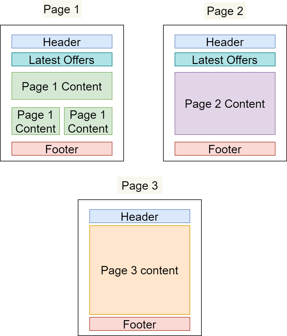
Example: Reusing Components Across Pages
In the example below, we have defined three different Pages that share Components:
The "Header" and "Footer" Components are common to all Pages
The "Latest Offers" Component is shown on Page 1 and Page 2 only
All three Pages have their own primary content area that is not present on any other Page
Benefits
Productivity
Building new content from pre-existing content is much faster than starting anew.
Standardisation
It’s easy to standardise when reusing Components across an application: there’s only one place to edit when changes are required, and those changes will propagate through the application everywhere that the Component is used – making common standardisations like theming easier to manage.
Quality & Safety
The modularity and deduplication that comes with componentisation reduces the cognitive load on content editors and developers, reducing the amount of code and allowing for more time and focus on important tasks such as quality, testing, and security.
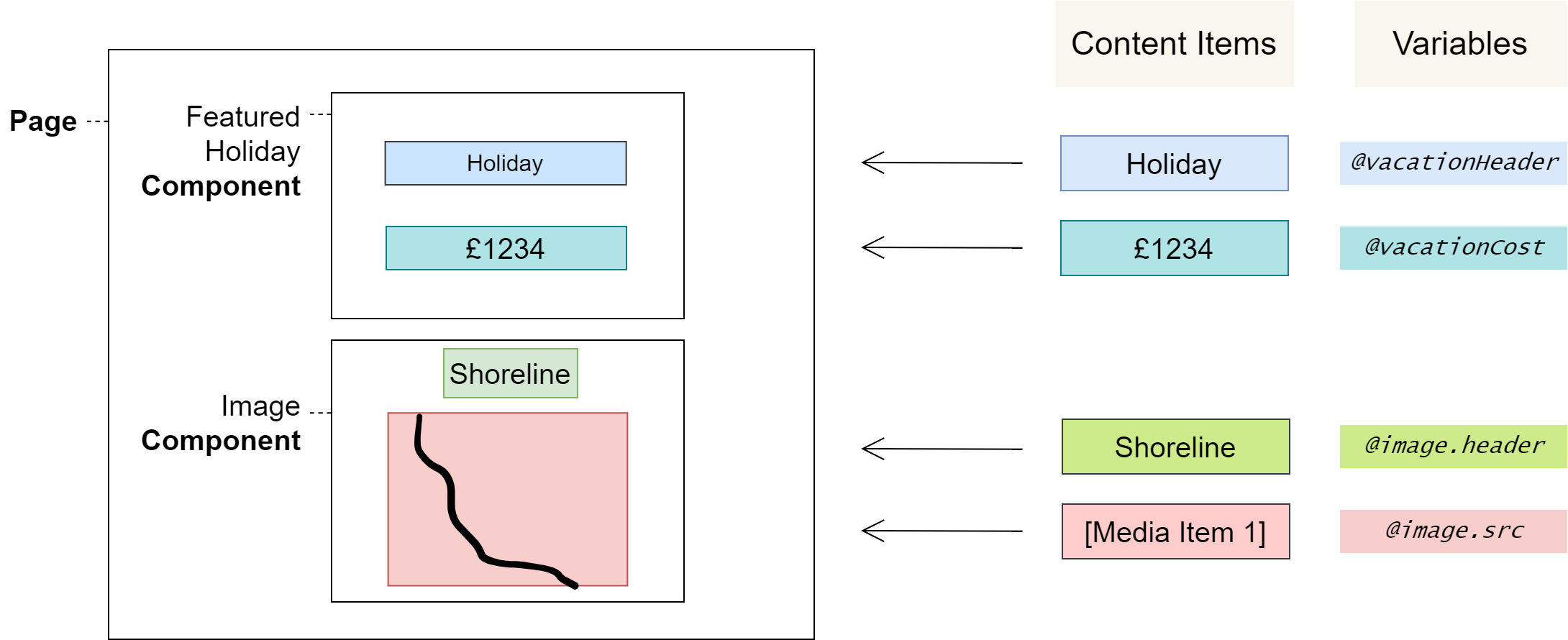
Component Variables
Component Variables create placeholders where content editors can insert Content Items
Sometimes reusing a Component in different places – with exactly the same content – is ideal, but sometimes a slight change in the Component’s content is preferable, to better match the particular context it’s used in.
Component Variables allow you to create placeholders in a Component where content editors can insert values known as Content Items using the Page Editor when the Component is later added to a Page.
Variable Types
The type of Content Item that content editors can insert depends on the Variable Type that you define; Component Variables can be one of the following Variable Types:
Media ItemNumber (integer)Number (real)PicklistRich TextTextTrue/False
Variable Names
Variable names are distinguished by a preceding @ and may include full stops . to namespace related Variables:
<h1>Welcome to the @page.name page</h1>

<div class="@icon.classes @container_classes">
  <img src="@icon.img.src">
</div>
Using Variables
Component Variables can be used for simple purposes like changing a textual heading, or more complex purposes like changing images and configuring styles.
A Component should maintain a distinct purpose, so be conscientious with the level of configurability that’s added – sometimes, creating a new Component is more appropriate than heavily configuring an existing one.
Deleting a Variable deletes its Content Items, which can result in data loss if the Task is completed.
Be careful not to accidentally delete Variables in the following ways:
By changing a Variable’s name or type
By cutting and pasting a Variable in the Component Editor
Work around this by using copy and paste instead
Component Collections
Component Collections define a block of code that can be repeated by content editors
Collections define a block of code that content editors may repeat one or more times in the Page Editor. Within this block of code a Collection Variable must be defined, as this enables the defining feature of Collections: that content editors can insert new Content Items into every iteration of the Collection.
Example: Creating a List of Fruits
Write the code once that content editors should be able to repeat, and then add to its containing element the ctx-foreach attribute with a value in the format <Collection Variable> in <Collection>. Finally, use the Collection Variable within this container:
<ul ctx-foreach="fruit in Fruits">
    <li>@fruit</li>  <!-- this line is repeatable -->
</ul>
Which could be used by content editors to create content like:
* Apple
* Orange
* Pear
* ...
Analysis
The code is composed of the following key points:
– The Collection name Fruits
– The Collection Variable fruit
– The Collection container, the ul element: <ul ctx-foreach="fruit in Fruits">...</ul>
– The Collection content, the li element: <li>@fruit</li>
When content editors build a Page using a Component with this markup, they’ll be able to repeat the Collection content – in this case, the list item <li>@fruit</li> – by editing a Collection called Fruits in the UI. They’ll also be able to insert a custom fruit name – or any other text, assuming the Variable type is Text – in place of the @fruit Collection Variable for each iteration that they create.
Collection Variables
Collection Variables differ from Component Variables in two ways:
1. They must be defined within the context of a Collection
2. They are defined once but allow content editors to set a Content Item for every iteration
Multiple Collection Variables
You can have multiple Collection Variables in a Collection. Just remember that, when doing so, the Variables have to be namespaced against the original Collection Variable declared in the ctx-foreach attribute:
<ul ctx-foreach="fruit in Fruits">
    <li>@fruit.name - @fruit.colour</li>
</ul>
This could be used to create content like:
* Apple - red
* Orange - orange
* Pear - green
* ...
Head and Body Components
Components created in the Component Editor have to be declared as Head, Body, or Head/Body Components. This is their Component Type, which designates whether the Component should be placed in the Page's Head or Body section, or if it can be used in either. The Head section corresponds to the <head> element of an HTML document, and the Body section to its <body>.
For example, a Component that adds SEO metadata to the page should be marked as a Head Component, since metadata tags can only be used in the <head> element. Similarly, a Component that links scripts or styles would also be well suited for the Head designation since those references are usually declared in the <head> element.
On the other hand, Components that provide page content are generally assigned to <body>, and could thus make sense as a Body Component Type.
Marking a Component as Head/Body provides flexibility as it means content editors can use a Component in either place – sometimes there isn't a best place to load content, or it's not immediately clear where that might be.
 Warnings
In the Component Editor, cutting and pasting code deletes Variables and recreates them, deleting all Content Items associated with them and resetting the Variable Type to the default – Text. You can work around this by copying and pasting instead.
User Journeys
Glossary
See the Glossary for more information.