
3.3 Picklist Concept: Developer
Conceptual Overview
A Picklist is a list of values that can be used in a Content Item
You can create a list of text values known as a Picklist and use it as a Variable Type in your Components. This gives content editors a selection of values to choose from when editing Content Items.
For example, you might create a Picklist containing theme colours, allowing content editors to quickly choose the appropriate colour values of a Content Item – and to see all of the options available.
The items of a Picklist are known as Picklist Items.
Picklist Items must be text values.
Picklists make it easy to reuse and standardise the values used in Content Items.
Conceptual Diagram
Picklists on a Page
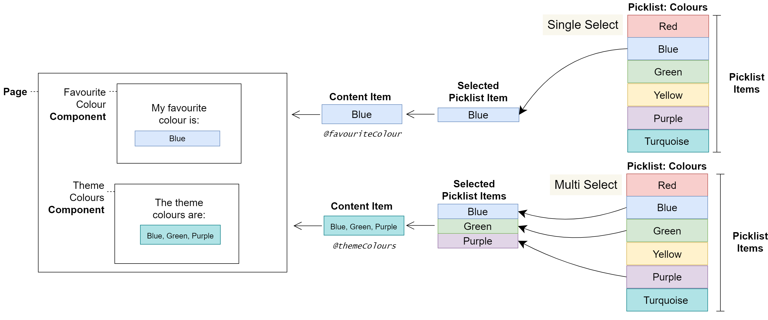
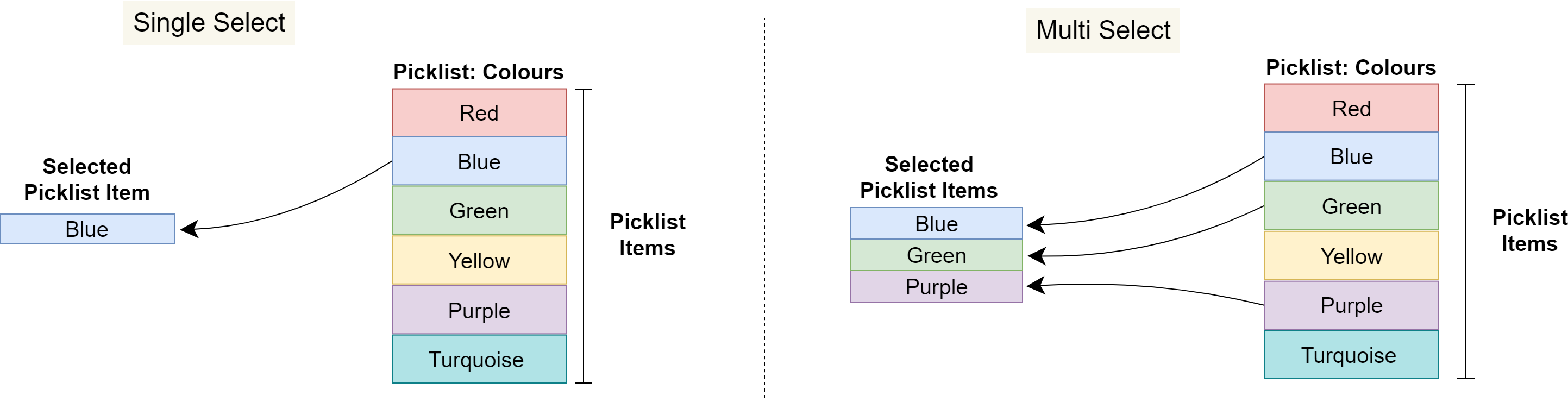
Single-Select and Multi-Select
Variables of the Picklist type must be configured as single-select or multi-select, which determines whether content editors can select one or several Picklist Items. When multi-select is configured, a delimiter must also be configured to join the chosen Picklist Items together into a final value for the Content Item.
Warnings
Picklists have been created for configuring non-displaying Content Items, such as style classes. Therefore, Picklist Items are not localisable.
User Journeys
Glossary
See the Glossary for more information.