
4.0 Component Concept: Content Editor
Components are created by developers
Introduction
Components are the building blocks of Pages. You assemble them into Pages in the Page Editor. They are reusable chunks of content – for example, hero banners, headers, and buttons. You can customise Components for different contexts.
In this section, you will learn:
What a Component is
How you use Components
How you can customise Components with Content Items
How Component Types determine where they can be used
Component overview
Components are the building blocks of Pages
Components are the reusable blocks you use to build Pages. They typically represent a singular piece of content – for example, a heading, button, or modal. You use them to quickly assemble and modify Pages.
You arrange Components into Page Layouts in the Page Editor. They can be reused on the same Page or across multiple. For example, you might reuse a button several times on the same Page, while a header could be reused on every Page.
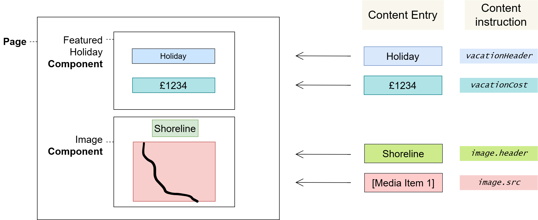
Once Components are added to a Page, you can fill out Content Items. These are editable values that allow Components to be customised for different contexts. Content Items exist where developers define placeholders known as Variables.
Components have a type – either Head, Body, or Head/Body. This determines which sections of the Page Layout you can use them in.
Pages, Components, and Content Items
The following diagram shows how Components can be laid out on a Page. Content Items are inserted where Variables have been defined by developers.
Reusing Components across Pages
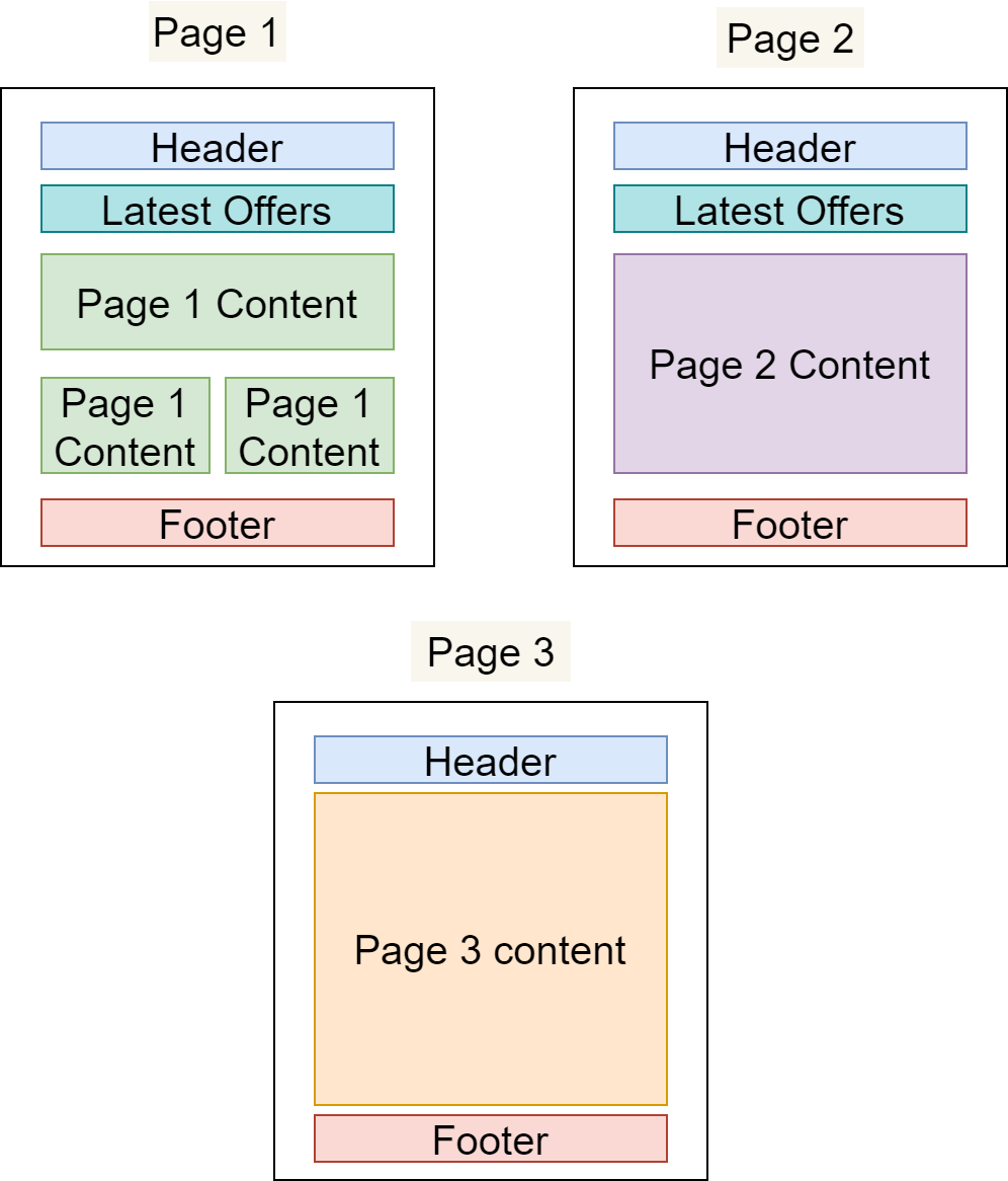
In the example below, we have defined three different Pages that share Components:
The "Header" and "Footer" Components are common to all Pages
The "Latest Offers" Component is shown on Page 1 and Page 2 only
All three Pages have their own primary content area that is not present on any other Page
The benefits of using Components
Productivity
Building from pre-existing content is much faster than starting anew.
Standardisation
It’s easy to standardise when reusing Components across an application: developers can make updates centrally in one place, and those changes will propagate through the application everywhere that you’ve used the Component – making common standardisations like theming easier to manage.
Quality & Safety
The modularity and deduplication that comes with componentisation reduces the cognitive load on content editors and developers, reducing the overall amount of content and lines of code, and allowing for more time and focus on important tasks such as quality, testing, and security.
Component Types
Developers designate Components as one of the following Component Types, which determines the Page Layout sections you can insert them into:
Component Type | Applicable Page Layout Section |
|---|---|
Head | Head |
Body | Body |
Head/Body | Head or Body |
Notes
Components may also include scripts, styles, SEO metadata and more that you can add to a Page.
Glossary
See the Glossary for more information.