
Introduction
Components are the building blocks of Pages. You write them in the Component Editor and content editors assemble them into Pages. They are reusable chunks of content – for example, hero banners, headers, and buttons. You can make Components customisable for content editors with Variables and Collections.
In this section, you will learn:
-
What Components are
-
How you use Components
-
How you can make Components customisable with Content instructions
-
How to choose a Component Type that defines where the Component can be used
-
How to choose a Component Channel that defines how the Component presents the Content entry values.
Component overview
Components are the building blocks of Pages
Components are the reusable building blocks from which Pages are built. They typically encapsulate pieces of content that are singular in purpose and reusable – for example, headings, buttons, or modals.
You can write Components in HTML or JSON in the Component Editor; content editors arrange them into Web (HTML) or Headless (JSON) Pages in the Page Editor.
You may include Content Instructions in your Components to make Components customisable for content editors. Content Instructions mark specific places where content editors can insert values known via Content Entries. Collections designate sections of a Component that content editors can repeat and customise.
For Web (HTML) Components you must choose a section type for your Components – either Head or Body. This determines which sections of the Page Layout content editors can use them in. For Headless (JSON) Components there is only a single Document section type.
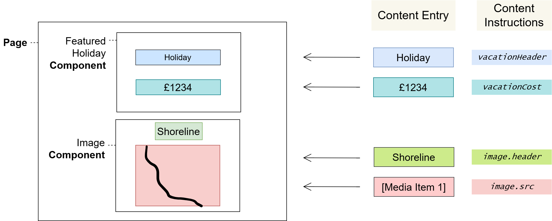
Pages, Components, and Content Entries
The following diagram shows how content editors can lay Components out on a Page, and how they can insert values from Content Entries in the places where you have defined Content Instructions.
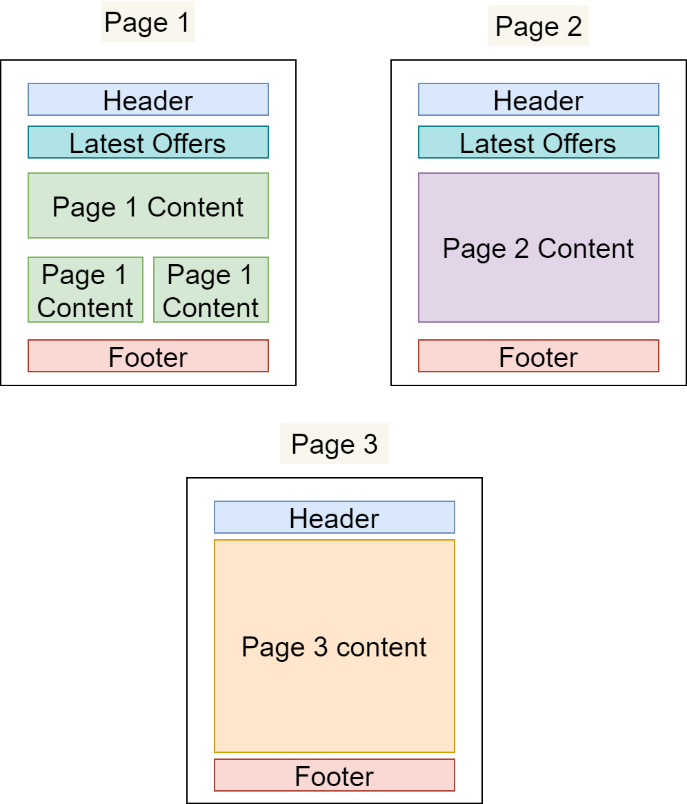
Reusing Components across Pages
In the example below, we have defined three different Pages that share Components:
-
The "Header" and "Footer" Components are common to all Pages
-
The "Latest Offers" Component is shown on Page 1 and Page 2 only
-
All three Pages have their own primary content area that is not present on any other Page
The benefits of using Components
-
Productivity
Building new content from pre-existing content is much faster than starting anew.
-
Standardisation
It’s easy to standardise when reusing Components across an application: there’s only one place to edit when changes are required, and those changes will propagate through the application everywhere that the Component is used – making common standardisations like theming easier to manage.
-
Quality & Safety
The modularity and deduplication that comes with componentisation reduces the cognitive load on content editors and developers, reducing the amount of code and allowing for more time and focus on important tasks such as quality, testing, and security.
Making Components customisable with Content instructions
You can use Content instruction to expose specific places in Components where content editors can insert custom values via Content entries. They may use these to modify Components in the Page Editor for the different contexts they’re used in – for example, in different positions on the same Page or on multiple Pages.
What is a Content instruction?
There are four instruction types available within Components; Content, Repeater, Child, and Slot. These replace Component variables, and Component templates that were used in previous versions of Forrit one.
Content Instructions provide various functions, such as defining where content is placed in your component, looping over collection items and linking to other components. Content, Repeater and Child Instructions are only present in the toolbar when you have selected a Content Type. Slot instructions are only available for components created for Web (HTML) channels.
If you are creating a JSON component, there is an additional feature for autogenerating the Component template. This feature will generate a like-for-like template based upon the Content Type structure. This can save time if you need a template that surfaces all or most of the Content Type fields.
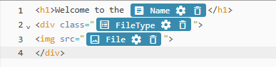
Content (Ctrl Alt v)
Content instructions are used to indicate where content is to be placed. The field selection will only permit value fields such as; True/False, Date Time, Numbers, Text, Media and Picklists. Multi-select Picklists, have additional configuration for a separator that you can adjust. The Content instruction name will be the Content type field name from the Content Type selected.
Content Instructions are distinguished and represented as a widget chip Instruction:
Deleting a Content Instruction unlinks the Content Entry field, which can result in page changes when the Task is completed.
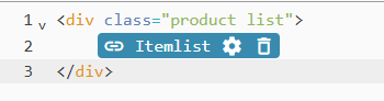
Repeater (Ctrl Alt r)
Repeater instructions define a section that content editors may repeat one or more times in the Page Editor. They are used to loop over Reference Link Collection fields: so that content editors can make each iteration of the Collection unique with Content Entries.
Simply configure the instruction by selecting the Reference Link Collection field you require and provide an Alias. The Alias will then be available for use inside the Repeater, to quickly access fields within that Reference link collection, this is especially helpful for Reference link collection fields that are deeply nested.
Example: Creating a list of fruit
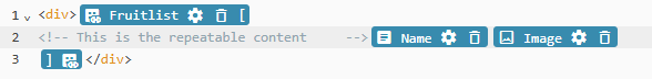
The code is composed of the following key points:
-
The Content type Reference link Collection:
Fruits -
The Repeater Instruction Alias:
Fruitlist -
The Content instructions that are looped over:
NameandImage
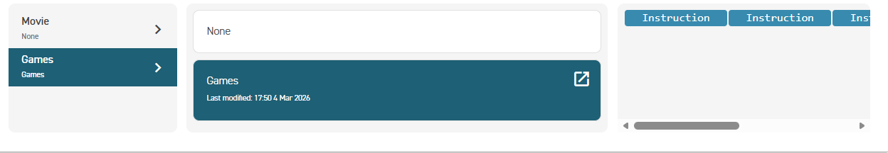
Child (Ctrl Alt c)
Child instructions provide a means to re-use components much in the same way you can re-use Content Types. If you have a common Component you wish to use for a Content Type, you can use the Child instruction to select that Component based on the Content Types linked to the Reference Link field.
You can select a default component or leave it set to None and allow the Content editor to select. The default can be changed by the Content editor.
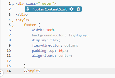
Slot (Ctrl Alt s)
Slot instructions are only available for HTML channels. They provide a placeholder for another Component that has no link or relationship to the Content Type the Component is using. When you place a Slot instruction, the Page Builder will allow you to drop any Component into this position so long as it matches the section (Head / Body) of the parent. This is like the Component Template slots used in previous versions of Forrit One.
Component Types
Web (HTML) Components created in the Component Editor have to be declared as Head or Body Components. Headless (JSON) Components are declared as Document. This is their Component Type, which designates whether the Component should be placed in the Page's Head or Body section for Web pages. The Head section often corresponds to the <head> element of an HTML document, and the Body section to its <body>.
For example, a Component that adds SEO metadata to the page could be marked as a Head Component, since metadata tags can only be used in the <head> element. Similarly, a Component that links scripts or styles would also be well suited for the Head designation since those references are usually declared in the <head> element.
On the other hand, Components that provide page content are generally assigned to <body>, and could thus make sense as a Body Component Type.
Component Channel
Components created in the Component Editor have to be declared as JSON or HTML. This is their Component channel, which designates whether the Component can be used for a Web (HTML) or Headless (JSON) page.
 Warnings
User journeys
Glossary
See the Glossary for more information.