Create a New Component
Purpose | The purpose of this work instruction is to provide the steps for creating a Component. |
Prerequisites | HTML markup & CSS |
Supplementary |
Creating a component
Navigate to the Components page from the side menu.
Ensure a task is selected.
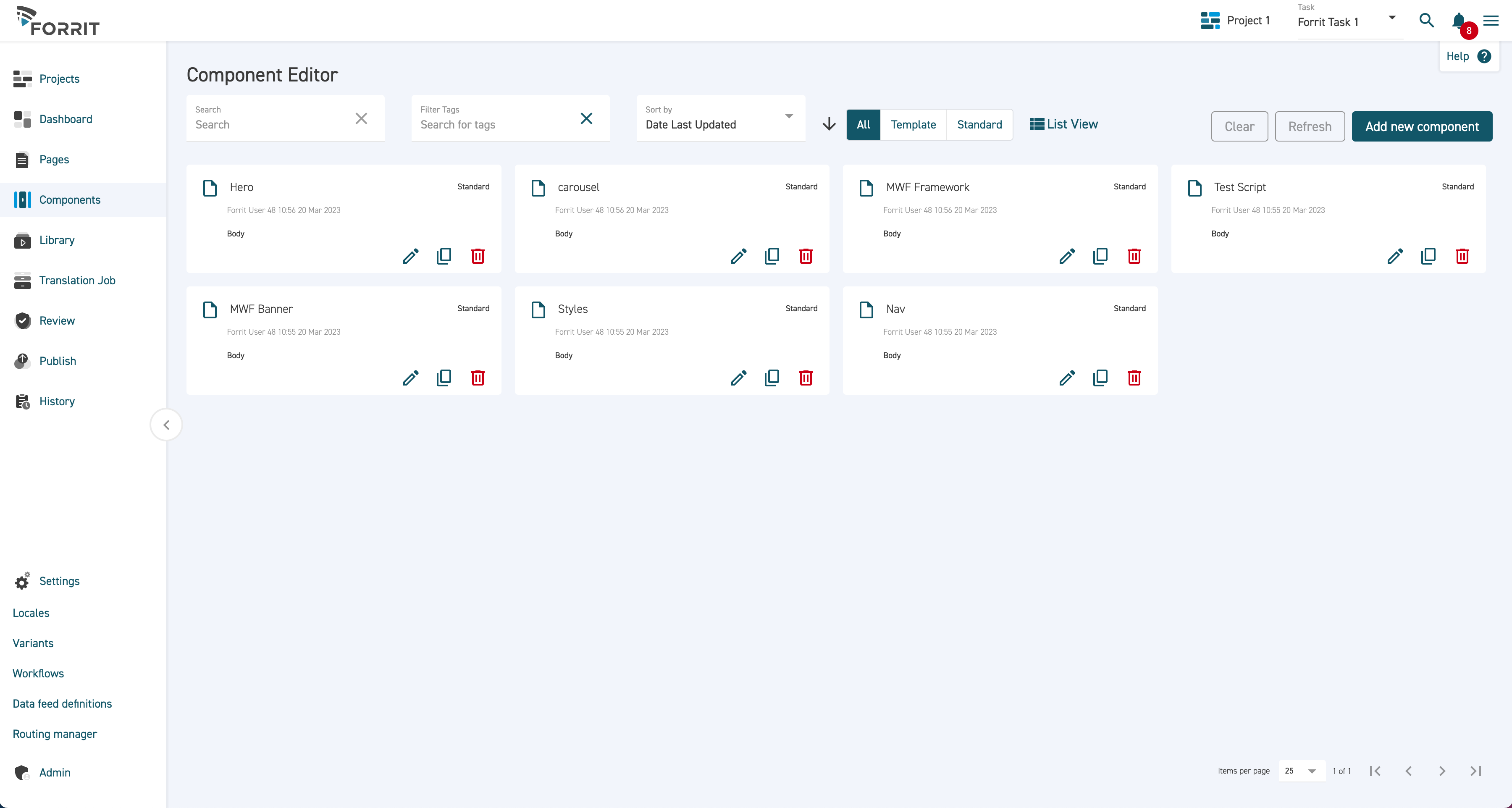
Click Add new component.
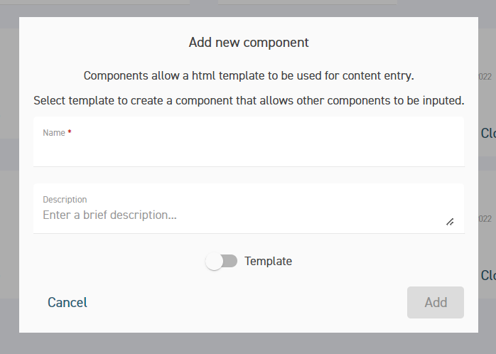
Enter a name and description then press Save. The component editor screen will open automatically.
Components can be classified in the following ways.
Layout location: Head, body or both. This is selectable in the Component Editor.
Standard or Template. If the Template toggle is activated in the Add new component pop-up, it will apply that label to the component and be displayed in the component card on the grid view. If the template toggle is left deactivated, the Standard label will automatically be applied.
For multi-use components, it is recommended to apply both Head and Body to avoid restrictions in the Content tab of the Page Editor.
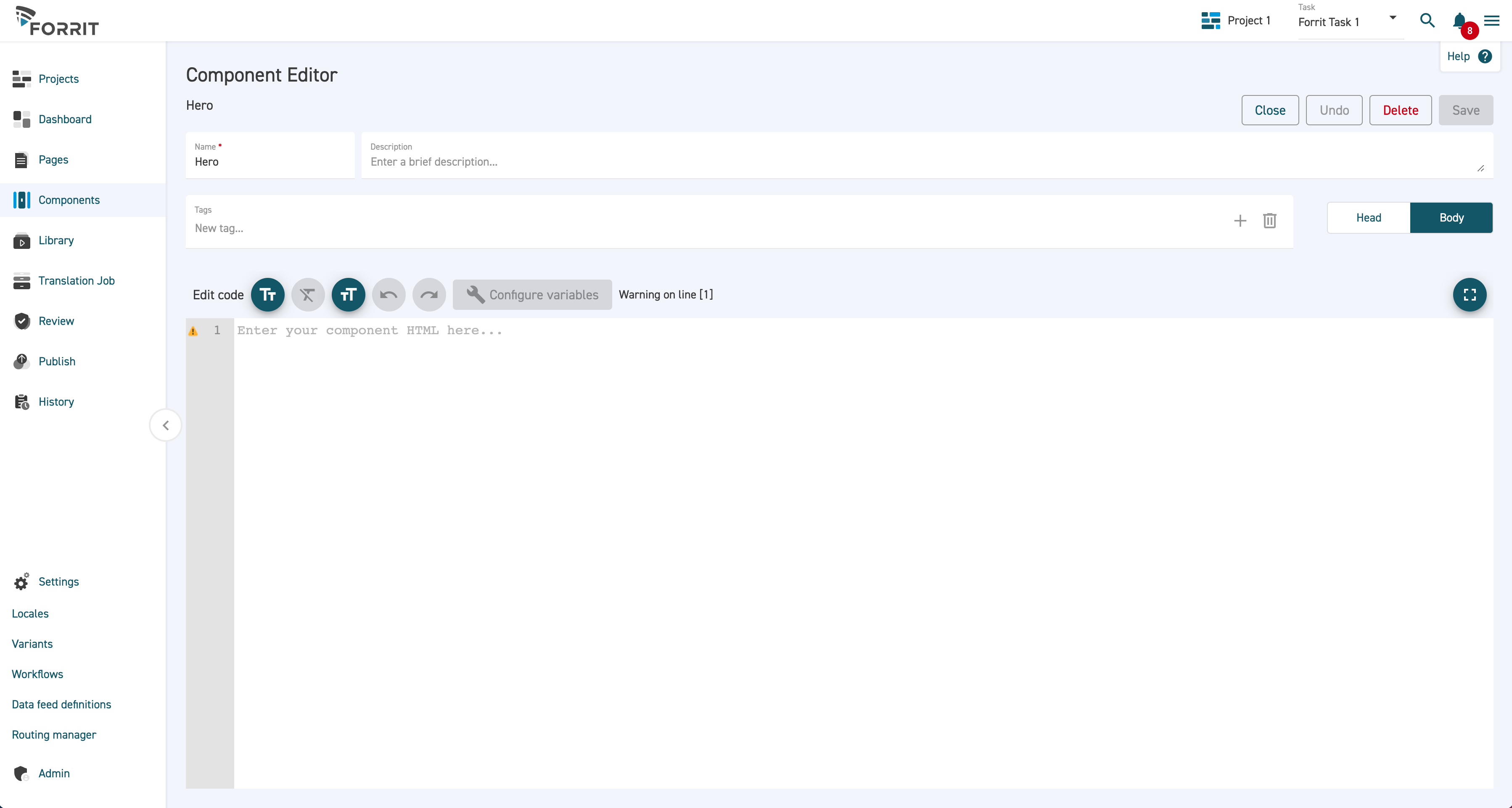
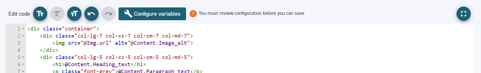
Enter the desired HTML. The text below shows an example of the component HTML.
CODE<div class="container"> <div class="col-lg-7 col-xs-7 col-sm-7 col-md-7"> <img src="@Img.url" alt="@Content.Image_alt"> </div> <div class="col-lg-5 col-xs-5 col-sm-5 col-md-5"> <h1>@Content.Heading_text</h1> <p class="font-grey">@Content.Paragraph_text</p> <div ctx-foreach="link in Content.Links"> <a href="@link.Href" id="@link.Client_id" class="ctex-cta @link.Classes" target="@link.Target" aria-label="@link.Aria_label" data-hide="@link.Hide" onclick="@link.Event"> <span>@link.Text</span> </a> </div> </div> </div>Note there are several @ symbols in the HTML above. These each represents an editable variable.
Click on the Configure Variables button.
Variables can be applied to each content item type in this screen.
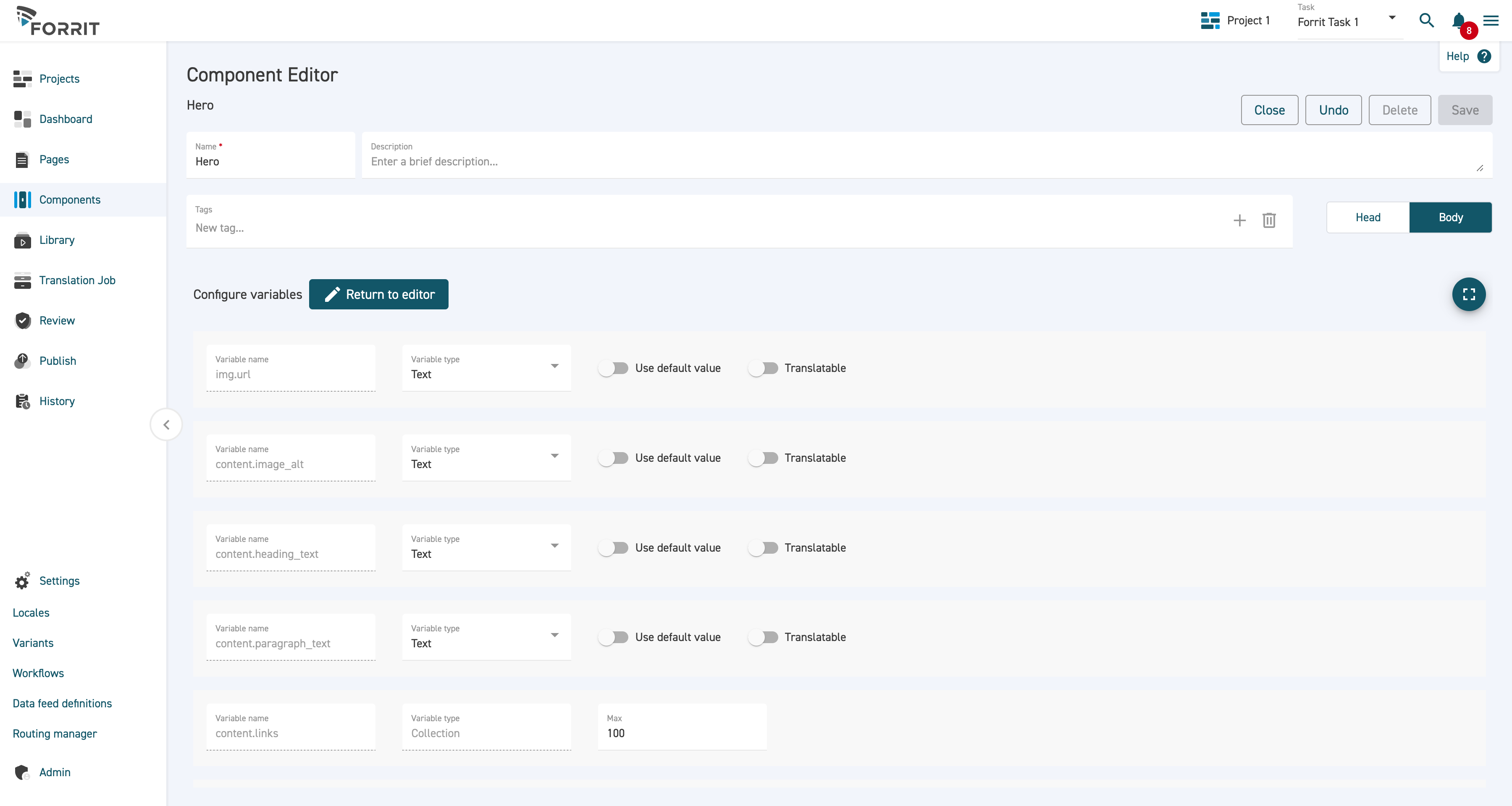
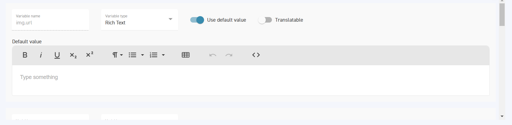
Select the type for each variable. Variable types can be one of:
Media ItemNumber (integer)Number (real)PicklistRich TextTextTrue/False
To add a default value to a variable, select the Use default value toggle button. A field will appear to allow the user to set the default value.
For text values which are visible on the website and may need to be translated, the Translatable toggle button should be selected.
When working with more than one Locale, please remember to set the Translatable toggle to ON. If this is not activated, it will not show as an enable item in the Translation tab.
Note: Picklists cannot be translated at this time. It is recommended to avoid using content in picklists and stick to classes only.
Complete the configuration then select Return to editor. This returns to the component editor screen.
Note that whenever you modify the HTML in a way that adds new variables, you must navigate to the variables screen before you are able to save the component.
Select Save.
If you are finished with the component, select Close to return to the component grid view.
Notes about the Rich Text Editor
The rich text editor is a tool that allows the style of a piece of text to be formatted without using HTML markup. It appears when using the rich text variable type.
The controls are similar to standard Word formatting controls. Hover over each icon to determine its function.
When working with multiple Locales, please remember to set the Translatable toggle to on.