
Introduction
You create Picklists to supply a standard set of text values that editors can use in their Content Entries. Often, this is to provide a safe way to configure the styles and metadata you define in your Components.
Picklist overview
A Picklist is a list of values that can be used in a Content Item
You can create a list of text values known as a Picklist and use it as a Content Instruction Type in your Components. This gives content editors a selection of values to choose from when editing Content Entries.
For example, you might create a Picklist containing theme colours, allowing content editors to quickly choose the appropriate colour values of a Content Entry – and to see all of the options available.
The items of a Picklist are known as Picklist Items.
Picklist Items must be text values.
Picklists make it easy to reuse and standardise the values used in Content Entries.
Conceptual Diagram
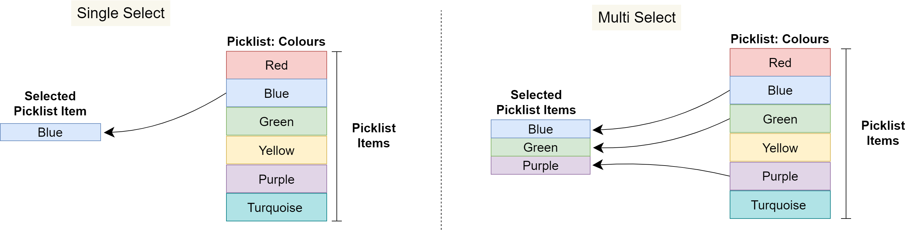
Single and Multi Select Picklists
Picklist Content type fields must be configured as Single Select or Multi Select, which determines whether content editors can select one or several Picklist Items. When multi-select is configured, a delimiter must also be configured in the Component to join the chosen Picklist Items together into a final string value for the Content Entry.
The following diagram shows how:
-
Content editors can only choose one value from a Single Select Picklist
-
Content editors can choose multiple values from a Multi Select Picklist
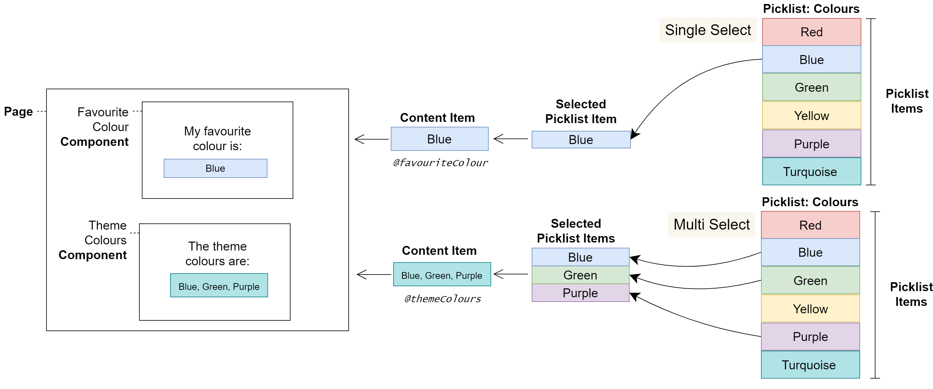
Picklists on a Page
In the following diagram, a content editor selects Picklist Items which change the styles and therefore the colours displayed on a Page.
Warnings
Picklists have been created for configuring non-displaying Content Entries, such as style classes. Therefore, Picklist Items are not localisable.
User journeys
Glossary
See the Glossary for more information.